
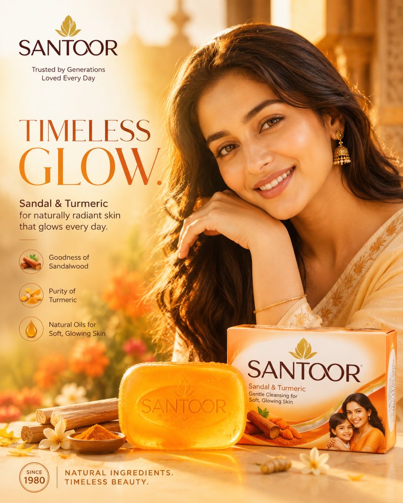
SANTOOR — “TIMELESS GLOW” MODERN INDIAN BEAUTY CAMPAIGN FORMAT: 4:5 vertical premium Indian beauty campaign, ultra-high resolution (8K) STYLE: warm lifestyle beauty advertising × Indian skincare realism × modern FMCG storytelling 🧠 BRAND DNA: Santoor represents: warmth, natural beauty, Indian femininity, youthfulness, family lifestyle. The campaign should feel: sunlit, approachable, naturally beautiful, emotionally warm. 🎬 VISUAL DIRECTION: Golden-hour Indian environment with: warm sunlight glow, sandalwood-inspired tones, soft natural reflections, flowing fabric textures, subtle botanical atmosphere. Beautiful Indian female model: natural smile, healthy glowing skin, traditional-modern styling, authentic warmth. Hair: soft natural movement, healthy realism. 🧼 PRODUCT HERO: Santoor Sandal & Turmeric Soap. Warm orange soap, natural translucent texture, soft golden reflections, premium skincare realism. Placed naturally within warm sunlight. ✍️ TYPOGRAPHY: “TIMELESS GLOW.” Elegant warm typography, friendly hierarchy, Indian beauty-commercial styling. Should feel: welcoming, soft, naturally premium. 🎨 COLOR SYSTEM: PRIMARY: warm orange, golden sunlight, soft sandalwood tones. SECONDARY: cream, natural beige, warm amber. Mood: youthful, warm, naturally radiant. 💡 LIGHTING: Golden-hour beauty lighting, warm cinematic softness, natural skin glow. 🔥 FINAL FEEL: Feels like: premium Santoor campaign × modern Indian beauty advertising × warm skincare realism. Warm. Youthful. Natural. Radiant.
DETTOL — “PURE PROTECTION” GLOBAL CLINICAL HYGIENE CAMPAIGN FORMAT: 4:5 vertical premium healthcare FMCG campaign, ultra-high resolution (8K) STYLE: clinical skincare advertising × pharmaceutical realism × minimal healthcare branding 🧠 BRAND DNA: Dettol represents: clinical trust, doctor-grade protection, sterile hygiene, scientific cleanliness. The campaign should feel: precise, minimal, clean, medical, globally trusted. 🎬 VISUAL DIRECTION: Bright clinical-white environment with: sterile green accents, subtle translucent textures, premium medical realism, soft bathroom diffusion, pharmaceutical-grade cleanliness. Modern Indian model with: healthy skin, genuine confidence, minimal styling, fresh post-shower realism. NO cinematic drama. NO exaggerated effects. 🧼 PRODUCT HERO: Dettol Original Soap. Amber translucent soap texture, embossed Dettol logo, clean condensation, clinical reflections, premium healthcare realism. ✍️ TYPOGRAPHY: “PURE PROTECTION.” Minimal healthcare typography, functional hierarchy, clean green-and-white balance. Should feel: scientific, trustworthy, medical. 🎨 COLOR SYSTEM: PRIMARY: Dettol green, clinical white. SECONDARY: soft silver, warm amber. Mood: sterile, safe, fresh. 💡 LIGHTING: Bright diffused skincare lighting, clean soft reflections, medical-commercial realism. 🔥 FINAL FEEL: Feels like: global Dettol healthcare campaign × premium hygiene commercial × pharmaceutical beauty realism. Clean. Clinical. Trusted. Safe.
DOVE — “REAL CARE” GLOBAL BEAUTY CARE CAMPAIGN FORMAT: 4:5 vertical luxury skincare-beauty campaign, ultra-high resolution (8K) STYLE: minimal beauty advertising × emotional skincare realism × luxury self-care photography 🧠 BRAND DNA: Dove represents: softness, real beauty, self-care, authentic confidence, human emotion. The campaign must feel: gentle, elegant, emotionally intimate, natural. 🎬 VISUAL DIRECTION: Soft creamy-white environment with: warm natural diffusion, subtle skin glow, minimal compositions, breathable negative space, luxury skincare softness. Realistic female beauty model: minimal makeup, natural skin texture, soft expression, intimate emotional realism. NO hard commercial energy. NO aggressive graphics. 🧼 PRODUCT HERO: Dove Beauty Bar. Creamy white soap, soft curved edges, premium skincare reflections, subtle moisture texture, minimal luxury styling. ✍️ TYPOGRAPHY: “REAL CARE.” Elegant minimal typography, clean spacing, soft luxury hierarchy. Should feel: calm, human, premium. 🎨 COLOR SYSTEM: PRIMARY: warm white, cream, soft gold. SECONDARY: light beige, soft skin tones. Mood: comfort, softness, authentic beauty. 💡 LIGHTING: Soft beauty diffusion, luxury skincare lighting, natural skin realism. 🔥 FINAL FEEL: Feels like: premium Dove global beauty campaign × luxury skincare advertising × emotional self-care realism. Soft. Elegant. Human. Authentic.