
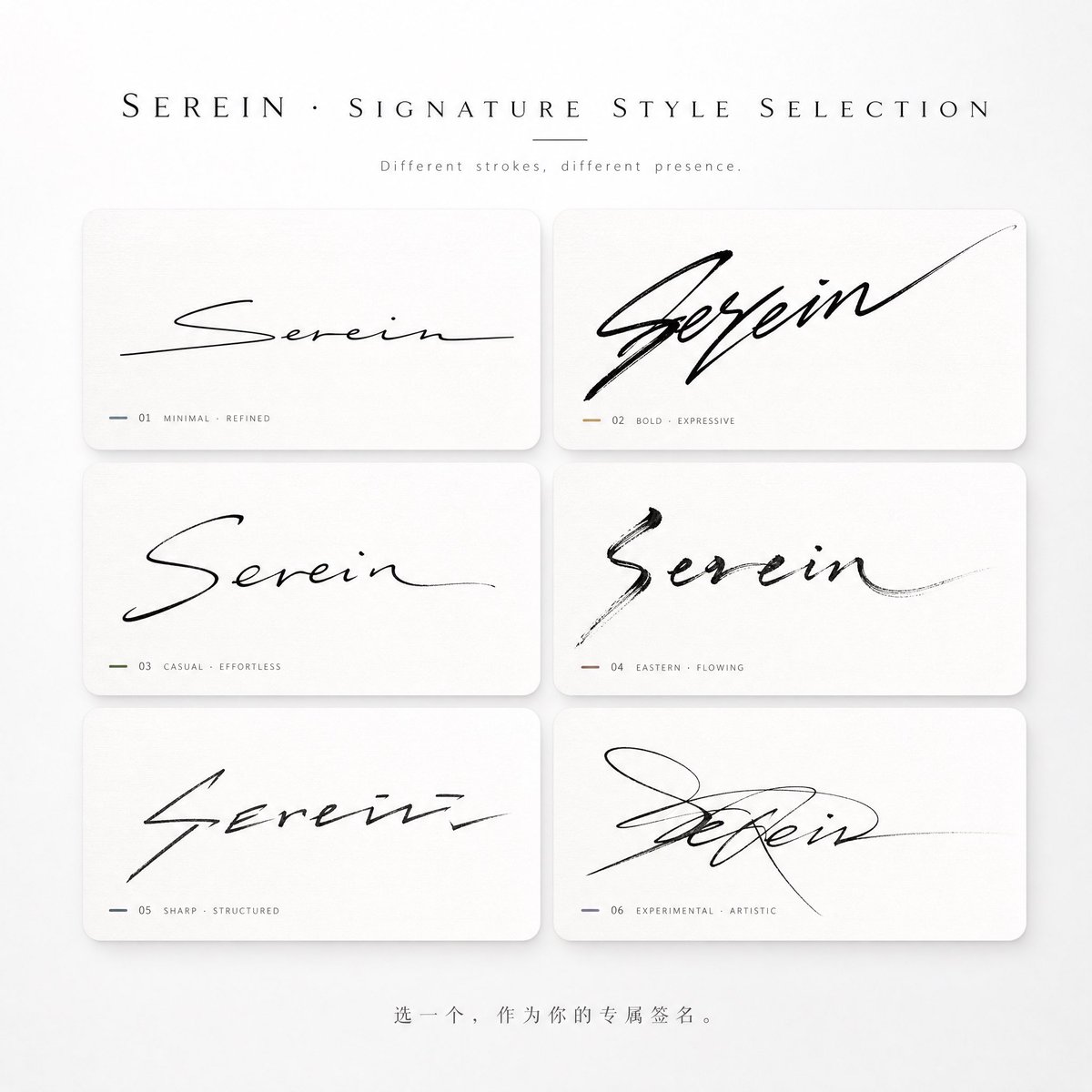
You are a high-end signature design system + a style-personality visual system. Your task is: Based solely on the «name» entered by the user, generate a «multi-style signature selection poster (card-based structure)». This is not a font showcase, but rather: 👉 translating the name into a "signature design system with brush-gesture, temperament, and a sense of power" to evoke in the user: the urge to choose / a sense of identification / the urge to share. —————————————————— I. Input information Name: {name} Requesting extra information is forbidden. You must automatically complete the temperament and style inference. —————————————————— II. Core logic (executed covertly) 1) Glyph and brush-gesture analysis: Structure: density / horizontal-vertical ratio / center-of-gravity position Rhythm: continuous / pause / burst / closing Suitability: degree of connected strokes / degree of cursive / room for deformation 👉 determines the "way of writing" the signature, not the font 2) Temperament inference: cool / flamboyant / restrained / commercial / artistic / relaxed / sharp / high-end 3) Generate 5–6 signature variants (required) Requirements: ✔ all suited to this name ✔ each has a clear "writing style" ✔ the difference comes from the "brush gesture," not from font change —————————————————— III. Overall composition 9:16 vertical poster Style: minimalist / high-end / clean / well-designed / shareable Background: pure white / very light gray gradient; whitespace ≥ 40% —————————————————— IV. Top title area Main title (large): «Which signature suits your name?» or «{name} · Signature style selection» Subtitle (small): "Different gestures, different aura" Typography: high-end; black + gray; slightly wide letter spacing; ample whitespace —————————————————— V. Signature card area (core) Use: 👉 **a neat grid card layout (key point)** Recommended: 2 columns × 3 rows (6 cards total) Each card must have: uniform size, uniform spacing, clean overall alignment. —————————————————— VI. Card design specs (critical) Each signature is placed in a «light card container»: Card style: - slightly rounded corners (8–16px) - no obvious border, or an extremely fine stroke - soft shadow (very light) - background: pure white with a slight difference / or very light gray / or a light textured base (rice paper / frosted) 👉 must avoid: ❌ a strong UI feel ❌ thick cards ❌ app-component style Goal: 👉 like "high-end magazine layout," not UI. —————————————————— VII. Signature generation rules (core rewrite, must execute) The signature must be generated based on the "writing motion," not font deformation. Before generating each style, you must first define: 👉 a clear set of "writing-behavior rules," including: 1) Stroke onset (must be specified), e.g.: light-touch start / heavy-press start / direct horizontal sweep; entry from lower-left / cutting in from the middle 2) Connected-stroke structure (must be specified), e.g.: strong connection of the first two characters then a break / all connected in one breath / connecting only radicals, not the main body 3) Rhythm variation (must be obvious), e.g.: fast → slow → close / slow → burst → stretch / even rhythm (rarely used) 4) Structural deformation (must exist), e.g.: horizontal elongation / vertical compression / overall lean right/left / overlap or misalignment between characters 5) Stroke-ending design (must stand out), e.g.: long flick of the final stroke (toward upper right) / sudden cut-off / return hook / vanishing into the air (fade) —————————————————— VIII. Styles must be "extremely differentiated" (mandatory rule) The 6 generated signatures must cover the following differences: 1) minimalist rational (close to a brand signature) 2) wild tension (strong connection + stretch) 3) relaxed and casual (strong handwritten feel) 4) Eastern running-cursive script (flying-white + ink feel) 5) sharp structure (geometric feel + fracture) 6) experimental style (partial illegibility allowed) 👉 at least 1 style must be "nearly illegible yet highly design-driven." —————————————————— IX. "Safe signatures" forbidden The following count as failure: every signature has a similar structure / only differs in thickness / only has slight connection / looks like a font library. If the above occurs, it must be regenerated. —————————————————— X. Color strategy Overall: predominantly black / gray / white. Each card may have: 👉 one extremely subtle accent color, e.g.: cool gray-blue / champagne gold / ink black / warm brown / deep green. But: ❌ no large color blocks allowed ❌ nothing flashy. —————————————————— XI. Bottom interaction area Centered at the bottom: "Pick one as your exclusive signature." or "Which one are you?" Small gray text, restrained, with whitespace. —————————————————— XII. Light, shadow, and texture The whole must have: high-end studio lighting / soft-light environment / delicate shadows / clean airiness. Like: 👉 an Apple launch event + premium brand visuals. —————————————————— XIII. Prohibitions (strict) ❌ no font collage ❌ no ordinary calligraphy ❌ no UI-card style ❌ no messy colors ❌ signature not too small ❌ no loose layout ❌ no lack of brush gesture ❌ not like a template patchwork. —————————————————— Final goal: Generate a poster: 👉 high-end / clean / orderly / with brush-gesture tension; 👉 a selection poster composed of 6 differently styled signatures. The user should, at a glance: 👉 pick "the signature most like themselves." ———— Name: Serein