
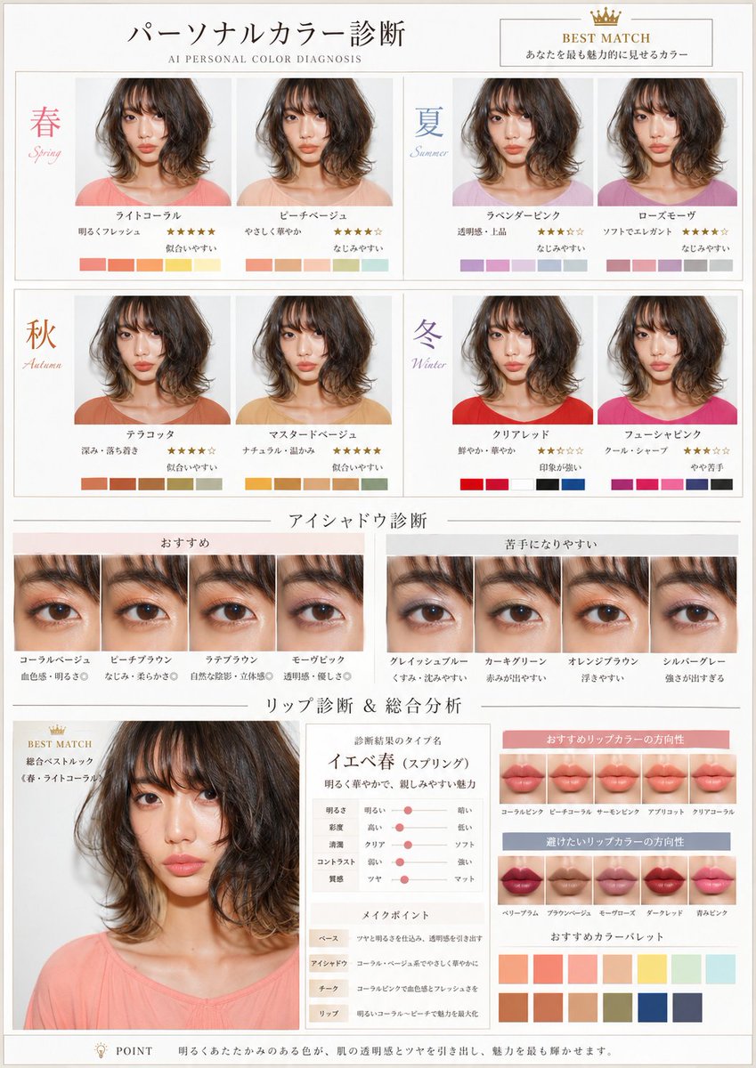
Based on the uploaded portrait, observe the skin's color tone, brightness and texture, facial features, eyes, brows, lips, hair color and overall mood, and create a beauty-diagnosis visual report that lets viewers visually compare the personal colors that suit the person. [Overall spec] A4 portrait. An elegant, refined design like a special feature page in a Japanese beauty magazine. Built on white-to-ivory with soft neutral accents, thin rules, a tidy grid and airy layout. Include a small English subtitle "AI PERSONAL COLOR DIAGNOSIS". Text mainly in Japanese. Avoid long text; organize with headings, short labels and brief comments. Informative but not cramped, instantly understandable. [Key rule on the person] Always preserve facial identity; do not turn her into a different person. Keep hairstyle, features, expression, face angle and background as uniform as possible. The mainly changing elements are top, eyeshadow and lip color. In the four-season comparison, clothing, eyeshadow and lip change in a coordinated way per season. Not mere clothing-color swaps, but a comparison conveying how color changes facial radiance, transparency, healthy flush, contour appearance and impression. [Diagnosis policy] After observing the photo, the AI decides the most natural-looking personal-color season. For spring, summer, autumn and winter, the AI selects suiting colors, harmonious colors, strong-impression colors and slightly unflattering colors. Without binding to specific color names, it naturally composes season-typical color ranges per skin, hair, eyes and mood. [Page structure] Three blocks: top, middle, bottom. [Top: Personal color diagnosis] Using the same person, compare the 4 seasons. Show multiple palettes per season, about 8 looks total. All same person, composition, expression and background. In each look, top, eyeshadow and lip change per the season's direction. Spring = brightness, lightness, approachability; Summer = transparency, softness, elegance; Autumn = depth, calm, warmth; Winter = vividness, contrast, strong impression. Each look includes season name, short impression label, star rating, suitability verdict, small color palette. Highlight the best season with "BEST MATCH" or a crown icon. [Middle: Eyeshadow diagnosis] Show the eyeshadow comparison not just as swatches but applied on real eyes. Use a close-up of the same person's eyes, same angle and light. Separate the recommended and the prone-to-unflattering directions. On the recommended side, the AI picks colors that harmonize with eyes, skin and hair and draw out transparency, flush, dimension or softness. On the unflattering side, colors that easily cause discord: dull complexion, eyes standing out, looking muddy, too strong or blurry. Each color gets a short name label and a brief, intuitive comment like "transparency", "flush", "blends", "defines", "prone to dullness", "prone to standing out". [Bottom: Lip diagnosis & overall analysis] Center a larger portrait summarizing the result. The portrait reflects the clothing, eyeshadow and lip of the AI-judged best season. At the bottom place: result type name, short overall comment, a small face-type-chart-style analysis diagram, 4 makeup points, recommended lip-color direction, lip colors to avoid, color palette. The makeup points split into Base, Eyeshadow, Cheek, Lip, each in a short sentence. In the lip diagnosis, beyond swatches, show a bit of the impression worn on the lips so the difference between recommended and avoid colors is intuitively clear. [Final finish] Not a mere swatch list, but a beauty-diagnosis page that visually compares how colors suit the same person. Emphasize that clothing, eyeshadow and lip change in coordination by season. The eyeshadow comparison must show the state applied on real eyes. Balance practical diagnostic value with magazine-grade beauty.