
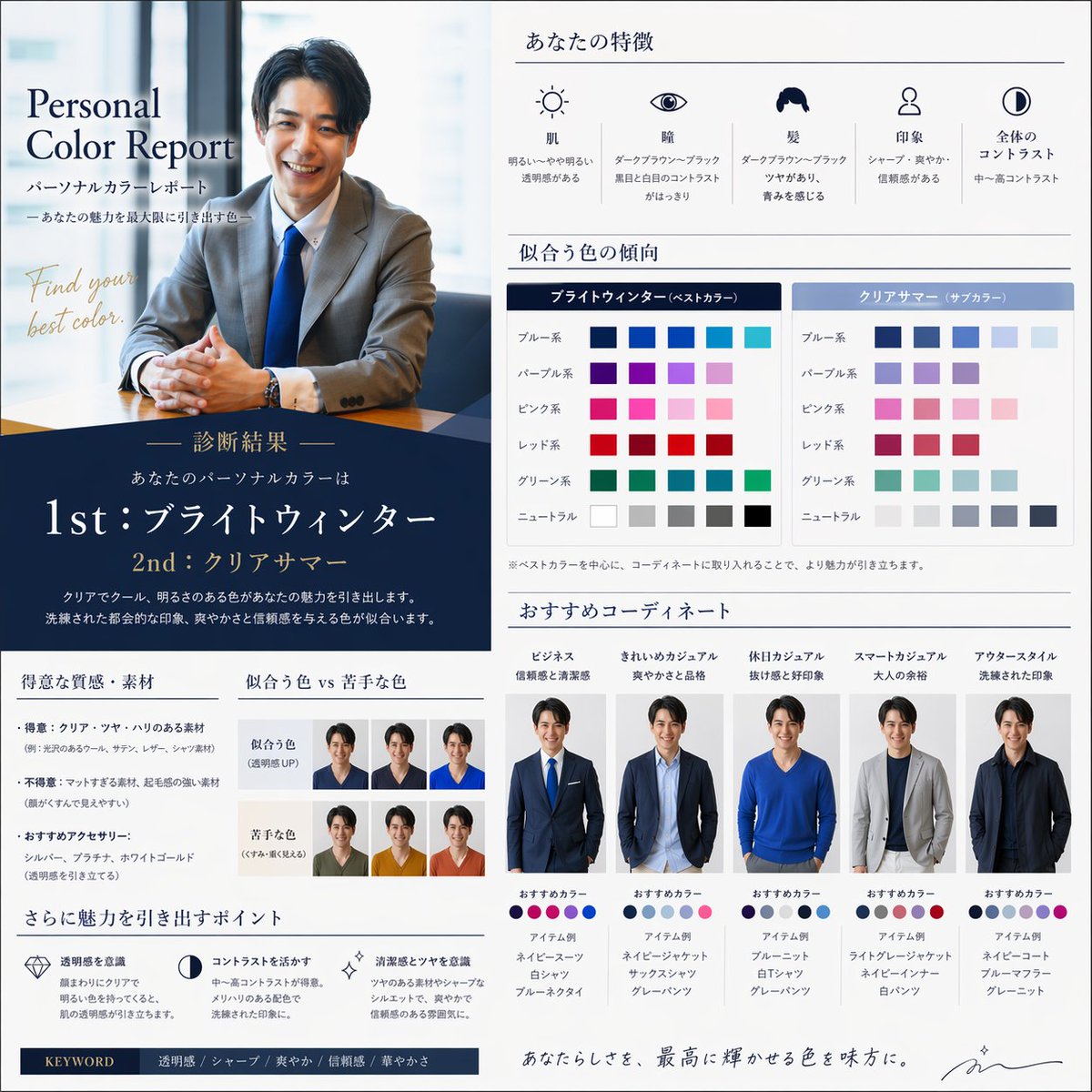
Create a high-end, modern Japanese personal color report infographic in a square format (1:1, 1080x1080). Use the provided face image as the main subject and keep the face consistent across all variations in the design. Design style: - Minimal, clean, and premium (inspired by luxury brand presentations) - Color palette: navy, white, gray with subtle gold accents - High readability with clear hierarchy and spacing - Mix of editorial magazine + UI dashboard style Layout structure: 1. Left or top section: - Main portrait (professional, smiling, natural lighting) - Overlay title: "パーソナルカラーレポート" - Subtitle: "あなたの魅力を最大限に引き出す色" 2. Diagnosis section: - "診断結果" - Large typography: 1st: ブライトウィンター 2nd: クリアサマー - Short explanation text in Japanese 3. Feature analysis section: - 肌 / 瞳 / 髪 / 印象 / コントラスト - Use icons + short Japanese descriptions 4. Color palette section: - Best colors (ブライトウィンター) - Sub colors (クリアサマー) - Show color swatches (blue, purple, pink, red, green, neutrals) 5. Outfit coordination section: - 4–5 styling variations using the SAME face - Examples: ・ビジネス ・きれいめカジュアル ・休日カジュアル ・スマートカジュアル ・アウター - Each with: - small portrait - recommended colors - item suggestions (e.g. ネイビースーツ, 白シャツ) 6. Comparison section: - “似合う色 vs 苦手な色” - small face examples with different color tops 7. Tips section: - 透明感を意識 - コントラストを活かす - ツヤ感・清潔感 Typography: - Mix of elegant Japanese serif + modern sans-serif - Emphasize key words with larger font Overall feel: - Clean, stylish, professional, Instagram-ready - Looks like a premium consulting report - No clutter, strong visual balance Ensure: - The face identity remains consistent - Lighting and realism are natural - Layout is well aligned and visually appealing